Freddie Mac Down Payment Assistance (Case Study in PDF)
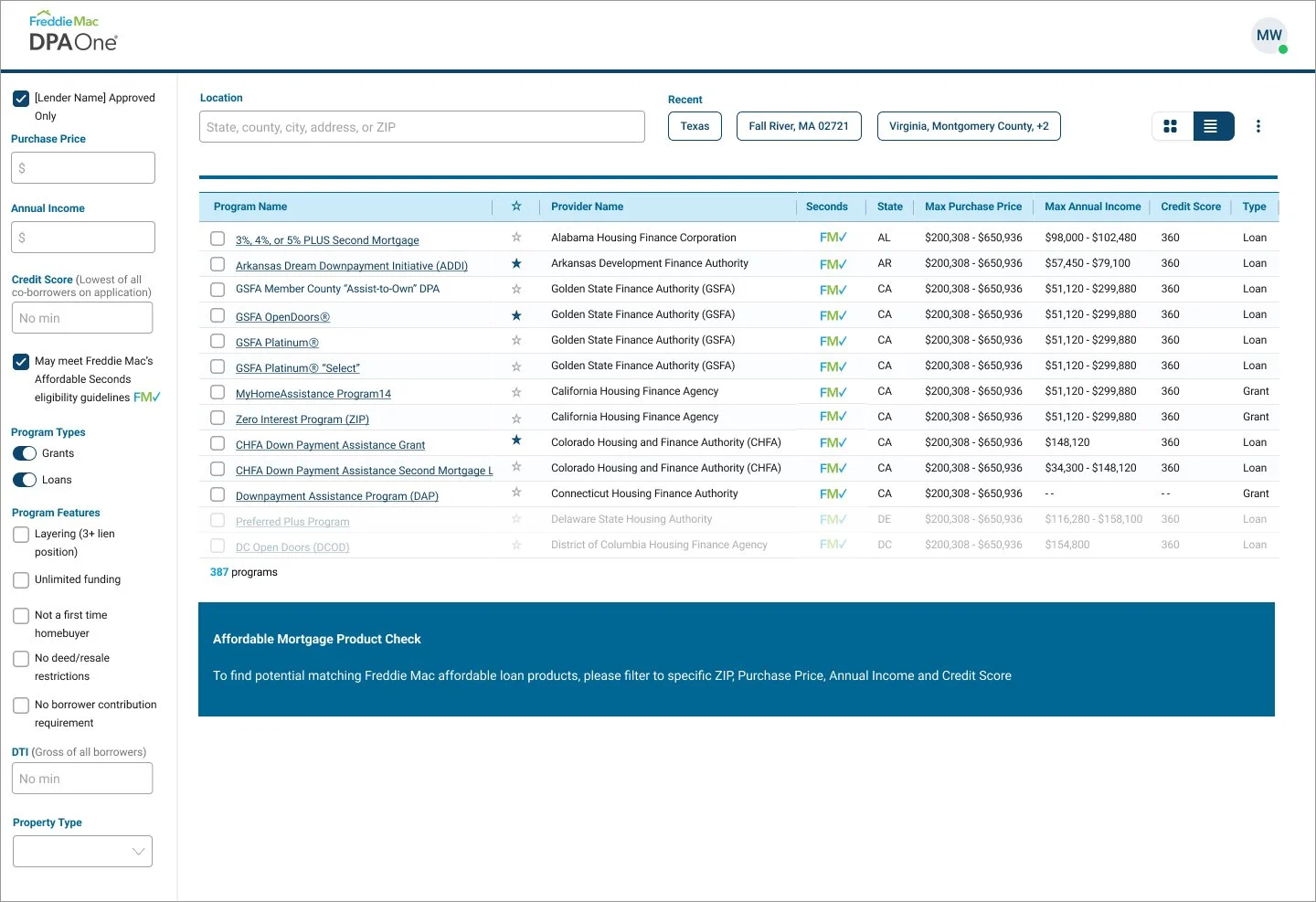
DPA One is Freddie Mac’s digital platform that helps loan officers, lenders, and housing professionals quickly find and compare Down Payment Assistance (DPA) programs for eligible borrowers. The platform consolidates hundreds of DPA programs into one searchable tool — empowering lenders to better support first-time and low-to-moderate-income homebuyers. My role focused on redesigning the legacy platform into a modern, scalable experience built on Freddie Mac’s new design system — improving usability, accessibility, and search efficiency.
Problem
The original DPA One platform was functional but inefficient:
Users had to manually fill out multiple required fields before seeing any program results.
Loan officers often described the process as “time-consuming and unpredictable,” and sometimes, even after completing all required fields, no DPA programs would appear — without any clear explanation why. This left users confused about whether there were truly no matching programs or if the system had failed to return results.
Many were unaware of all available DPA programs due to the linear, form-heavy interface.
As a result, users spent significant time searching, and Freddie Mac received feedback about low engagement, confusion, and lack of transparency.
Approach
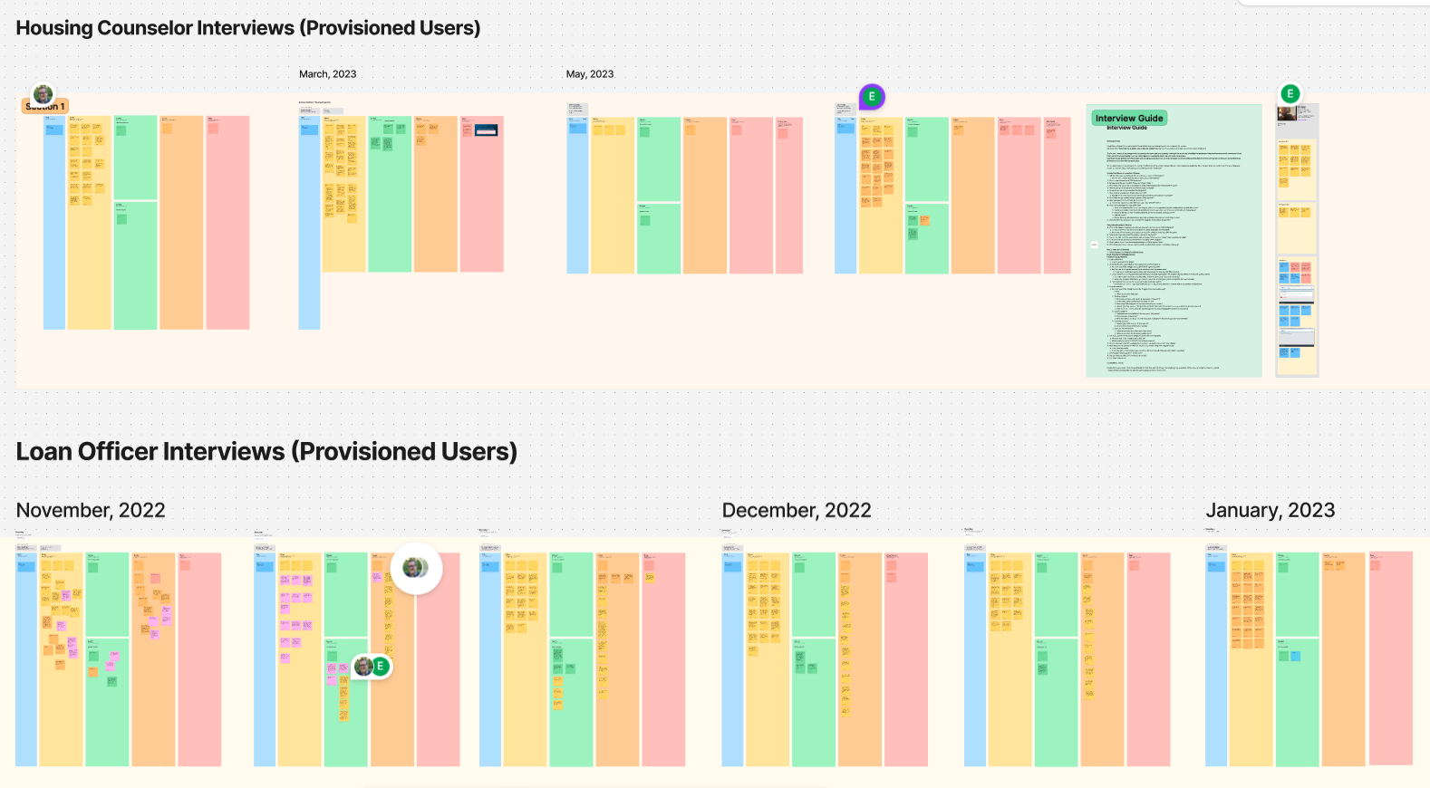
Stakeholder and User Interviews
Conducted interviews with loan officers and housing professionals to identify their key frustrations and goals.
Mapped out the end-to-end user journey and surfaced recurring pain points around “form fatigue,” poor discoverability, and lack of feedback when no results appeared.

Synthesis & Insights
Organized insights using affinity mapping and journey maps.
Key finding: Users wanted to browse first, not complete mandatory fields before discovery.
Identified a strong need for transparency — users wanted to understand why certain programs were or weren’t showing up.

Redesign Strategy
Reimagined the workflow to show available DPA programs first, allowing users to filter and refine later.
Introduced clear visual states for “no matching results” with contextual explanations and next-step guidance.
Rebuilt the UI using Freddie Mac’s new Design System, ensuring scalability, accessibility (WCAG/Section 508), and consistency across digital products.
Collaboration & Iteration
Partnered closely with product, research, and engineering teams for iterative design reviews and handoffs.
Conducted usability testing sessions with loan officers to validate the new discovery flow and refine microinteractions.

Before:
Users had to complete multiple required fields before seeing results — and often saw “no programs available” without any explanation why. This caused confusion and frustration during daily workflows.
After:
Users can now explore available programs immediately and refine them using filters. Clear visual feedback explains when no matches exist, helping users stay informed and confident in the platform.
Solution
The redesigned experience focuses on “browse-first, filter-later” logic:
Users immediately see available DPA programs relevant to their region.
Contextual filters (e.g., income level, loan type, location) allow quick refinement.
Clear empty-state messages guide users when no programs match, improving transparency.
Simplified interface built on the Freddie Mac design system improves clarity, consistency, and trust.
Impact
Reduced search time for DPA programs by simplifying discovery and filtering.
Improved user confidence through transparent messaging when no results appeared.
Increased engagement among loan officers who could now see programs upfront.
Enhanced scalability via adoption of Freddie Mac’s unified design system.
Positive usability feedback from participants citing the experience as “faster,” “clearer,” and “much easier to navigate.”